1
UI scaling issues persist
- Done
|
|
Waylon Morgan |
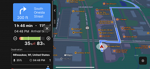
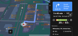
Icons (X button) are still overlapping in default sizing in landscape mode.
Also as a suggestion theres a lot of unused space for the icons at the bottom for 3x2 instead of 2x3 to lessen the need to scroll further down.
ABRP: 4.4.1
iOS: 16.5
Device: iPhone 14 Pro Max


Activity Newest / Oldest
Mattias_ABRP
Status changed to: Done
Mattias_ABRP
Hey Waylon, this issue is not fixed in our development code and also added some extra to the landscape mode. These changes will be included in the next release.
Waylon Morgan
Looks great! Appreciate your guys’ work!
Mattias_ABRP
Status changed to: In progress
Linda
Hi Waylon
Thanks for reporting this. We will look at it.
Linda
Status changed to: Investigate