The operating logic for the saved plans is illogical
- Done
|
|
TomTomZoe |
ABRP V4.4.3
The operating logic of the saved plans is illogical
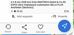
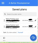
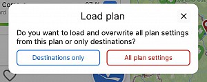
If you press "save plan" you get a list of all saved plans. If you click on one of the saved plans, I expect that you can replace the previous plan with the new one. In fact, this gives you the ability to load the map. But why? It's about saving plans, isn't it? To get the possibility to load a plan in this situation is irritating and illogical.
At this point, you should not be able to load an existing plan by clicking on it.
I know that you can save the plan by clicking on the cloud icon. But this symbol with the arrow pointing upwards isn‘t very self-explanatory. Saving something is usually associated with downwards and not upwards. Please improve this icon.


Activity Newest / Oldest
Katya_ABRP
This ticket has been moved to our new feedback portal; abrp.featurebase.app/en/p/the-operating-logic-for-the-saved-plans-is-illogical-2
Katya_ABRP
Status changed to: Done
TomTomZoe
ABRP V4.7.2 (2570)
iPhone 12 Pro iOS 17.2.1
The way to save plans has been completly changed.
So the issue is fixed.
TomTomZoe
ABRP V4.6.3
Still same issue.
TomTomZoe
ABRP V4.6.0 (2401)
Still same issue
TomTomZoe
No improvement with V4.5.2 (2352)
TomTomZoe
ABRP v4.5.0 (2347)
Still illogical operation. Please improve this.
TomTomZoe
ABRP V4.4.6 (2305)
Still illogic operation
TomTomZoe
ABRP v4.4.5 (2300)
Still same issue
TomTomZoe
ABRP V4.4.4 (2287)
Still same issue