6
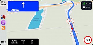
The current vehicle position is displayed too high on the map with CarPlay
- Done
|
|
TomTomZoe |
ARBP 4.2.0 with CarPlay and iPhone 11 Pro iOS 15.4
The current vehicle position is displayed too high on the map with CarPlay.
It is not interesting to see what was in the past on the map, but to see what will happen in the near future.
Therefore the vehicle position (calculated from below) should be displayed at about 20 to 30% of the screen height, as it was in before V4.2.0.


Activity Newest / Oldest
Katya_ABRP
This ticket has been moved to our new feedback portal;
abrp.featurebase.app/en/p/the-current-vehicle-position-is-displayed-too-high-on-the-2
TomTomZoe
ABRP V4.7.2 (2572)
iPhone 12 Pro iOS 17.2.1
In the 3D view you now have a better overview of the route ahead as the viewing angle is now flatter.
This is an improvement, especially in the city area.
Katya_ABRP
Status changed to: Done
Katya_ABRP
Hi all,
Following up on this. The placement in CarPlay should be lower for you now and marking this as done. ABRP 4.7.0 will also be out on iOS soon.
/Katya
TomTomZoe
With ABRP V4.3.2 the car position is still too high.
Driving with city or highway speed you can't see far enough ahead on the ABRP map.
TomTomZoe
With ABRP V4.2.8 (1011) the car icon position is still too high, it should be at or below 25% of height.
TomTomZoe
With ABRP V4.2.6 unfortunately it’s not improved yet.
TomTomZoe
This is like Google Maps and Apple Map are handling the car position on their maps.
I like that one from Apple (left
picture) the best.
The car position in the Google map (right picture) is a little bit too low in my opinion.
TomTomZoe
ABRP V4.2.5 can still be improved concerning the position of the car on the map.
Bo_ABRP
Status changed to: In progress
Bo_ABRP
Agree that most of the map should be used for the future driving; we have had some issues with very wide screens that we end up outside the screen with the marker. We'll check and improve.