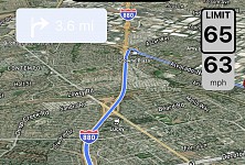
Poor contrast and fainted turn/exit indicator
- Done
|
|
Rickie |
Description:
While using the navigation application, I noticed that the upcoming turn indicator located in the top left corner of the screen is extremely faint and hard to read. The text and arrow indicating the next turn blend into the background due to the poor contrast.
Steps to Reproduce:
1. Open the navigation application.
2. Start a route that includes turns.
3. Observe the upcoming turn indicator in the top left corner.
Expected Behavior:
The turn indicator should be clearly visible with high contrast, making the text and arrow easy to read against the background.
Actual Behavior:
The turn indicator is very faint, with poor contrast, making it difficult to read.
Device Information:
• Device Model: iPhone 14 Pro Max
• Operating System: iOS


Activity Newest / Oldest
Katya_ABRP
Status changed to: Done
Bo_ABRP
Status changed to: In progress
Bo_ABRP
Thank you! We will fix this one asap.
Linda
Status changed to: Investigate
Rickie
Version 5.0.4