
Voters 2
-
-
A
2
Overview in Apple CarPlay is horrible
- In progress
- Subscribe
|
A |
Arie Roeling |
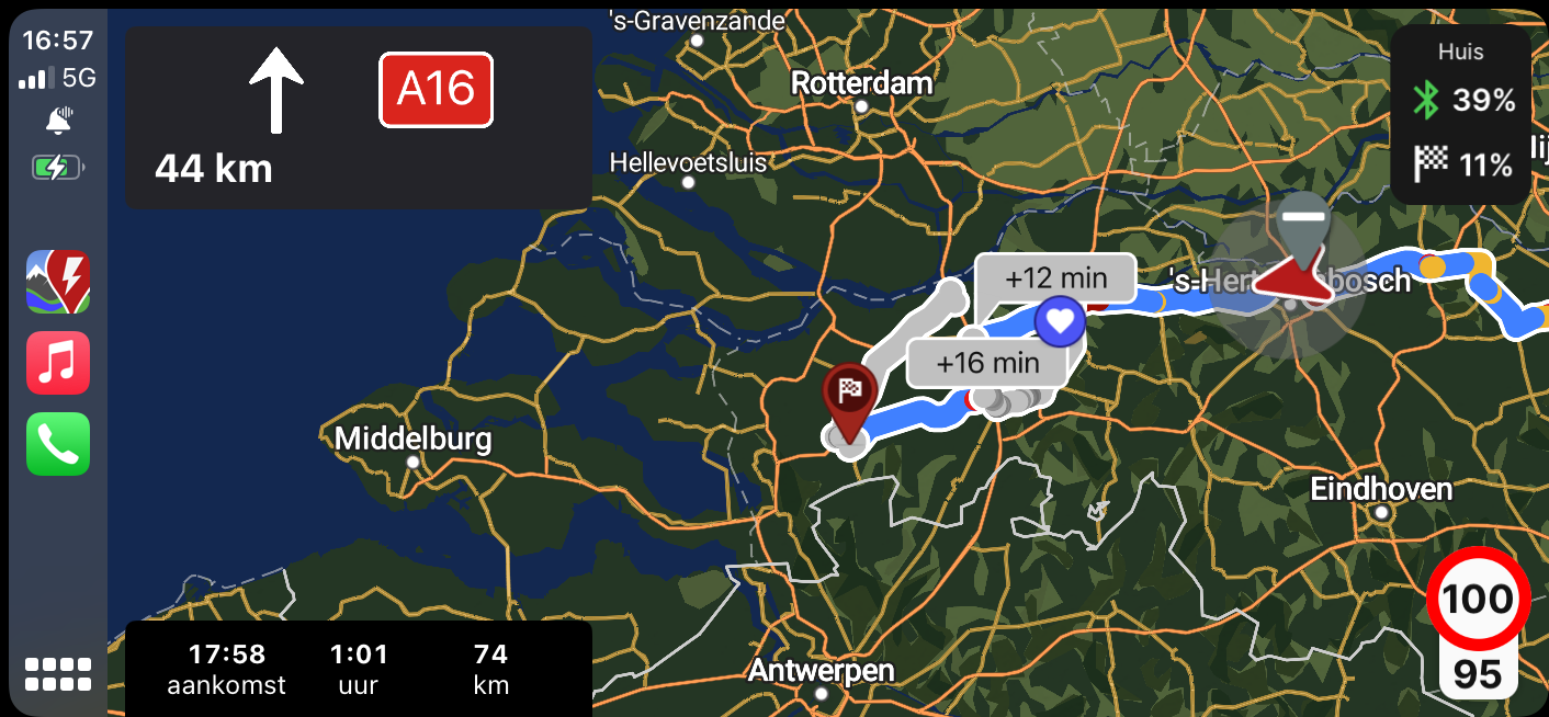
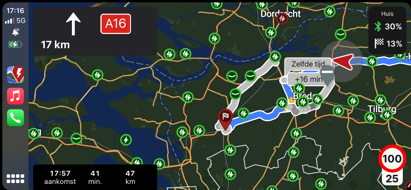
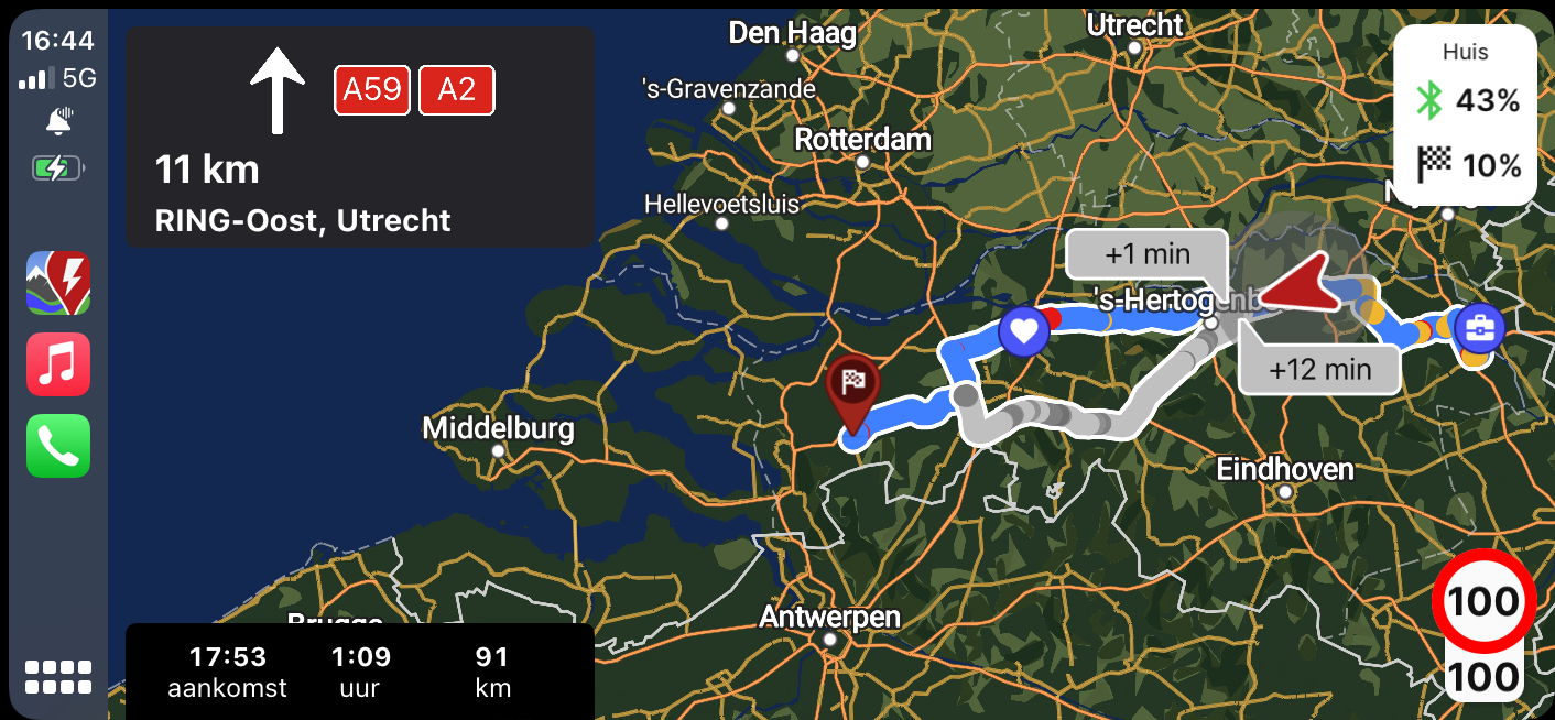
Since last update the overview in Apple CarPlay is horrible. The boxes with the additional time needed are placed on the location of the vehicle and the route. The symbols of the charger are positioned on those boxes with the additional time. The route overview could more aligned to the left where is some room left. The lines which represent the route (blue for actual and grey for alternative) are quite big. This gives you also not a good overview of your route.
Activity Newest / Oldest
Katya_ABRP
Status changed to: In progress
Bo_ABRP
We are looking into how to improve this. Thank you for reporting!